Introduction
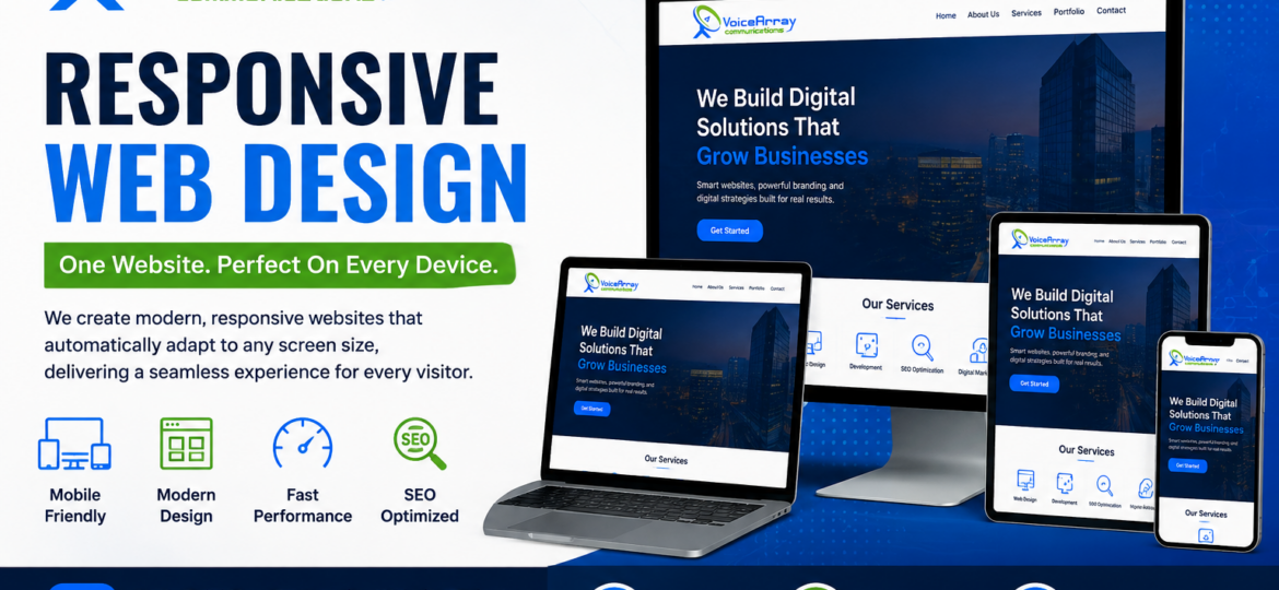
Responsive Web Design is an essential approach to creating websites that provide a consistent, usable experience across smartphones, tablets, laptops, desktops, and other screen sizes. Instead of designing separate websites for every device, responsive web techniques allow one website layout to adapt to the available screen space.
Today, visitors may discover a business through a phone, research it on a tablet, and complete an inquiry from a desktop. If the Web Design does not adapt properly, users may encounter tiny text, difficult navigation, horizontal scrolling, misplaced buttons, or slow-loading images.
For businesses investing in Web Design Services, responsive design is therefore more than a visual feature. It is part of creating an accessible, usable, search-friendly digital experience.
What Is Responsive Web Design?
Responsive Web Design is a Web Design approach that allows a website’s content and layout to adjust according to the user’s device and available screen space.
A responsive website can change its columns, navigation, typography, images, spacing, buttons, and other elements as the viewport changes. Modern CSS technologies such as Flexbox, CSS Grid, relative units, media queries, and responsive images make this possible. MDN describes responsive design as an approach for making web pages work well across different screen sizes and resolutions.
The goal is simple: the website should remain easy to use regardless of how someone accesses it.
Responsive Web Design commonly includes:
- Flexible page layouts
- Mobile-first development
- Responsive images and media
- Flexible typography
- Touch-friendly navigation
- CSS media queries
- CSS Grid and Flexbox
- Appropriate spacing and content hierarchy
- Testing across different screen sizes
Why Responsive Web Design Matters
The way people access websites has changed significantly. A business website can no longer be designed primarily around one desktop screen size.
Responsive Web Design helps businesses create a more consistent experience for visitors while reducing the need to maintain separate desktop and mobile versions of the same website.
Better User Experience
A responsive layout makes it easier for visitors to read content, navigate menus, tap buttons, complete forms, and find important information.
For example, a desktop navigation menu may work well across a wide screen but become crowded on a smartphone. Responsive Web techniques can transform that navigation into a mobile-friendly menu while preserving the same core content.
Mobile-Friendly Browsing
Smartphones provide a relatively small viewing area, so website content must be organized carefully. Text needs to remain readable, buttons need sufficient touch space, and images should fit their containers without causing unwanted scrolling.
Responsive Web Design addresses these challenges by allowing layouts to adapt rather than forcing users to zoom or scroll sideways.
Better Website Performance
Responsive design and performance optimization should work together. Large desktop images, unnecessary scripts, and poorly optimized assets can create a poor experience on mobile connections.
Responsive image techniques such as srcset, sizes, and the <picture> element can help deliver more appropriate images for different viewing conditions. MDN also notes that downloading unnecessarily large images can waste bandwidth, particularly on smaller devices.
Easier Website Maintenance
A single responsive website can be easier to maintain than separate desktop and mobile websites. When content needs to be updated, businesses can generally manage the same underlying pages instead of maintaining multiple versions.
This can make ongoing Web Design Services, content updates, SEO improvements, and technical maintenance more straightforward.
How Does Responsive Web Design Work?
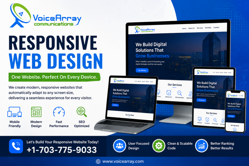
Responsive Web Design combines several technologies and design principles rather than relying on one feature.
Flexible Layouts
Instead of building every section around fixed pixel dimension, developers can use flexible grids and relative units so elements can adapt to the available space.
CSS Grid and Flexbox are particularly useful because they support flexible layouts and can adjust how elements are arranged as space changes.
Media Queries
Media queries allow CSS to apply different styling based on characteristics such as viewport width, orientation, resolution, or user preferences.
For example, a website might display multiple columns on a wide screen and move those columns into a single-column layout on a narrow screen. MDN identifies media queries as a key component of responsive design.
Mobile-First Design
Mobile-first design starts with the smallest practical screen and progressively enhances the layout for larger screens.
This approach encourages developers to prioritize the most important content and functionality first. MDN describes mobile-first responsive design as starting with a narrow-screen layout and adding layouts for wider screens as space becomes available.
Responsive Images
Images should adapt to their containers instead of overflowing the page. Modern responsive image techniques can also help browsers select an appropriate image resource for the user’s circumstances.
This is particularly useful for websites containing product images, service photos, portfolios, blog graphics, and other visual content.
Responsive Typography
Typography should remain readable across different screen sizes. Font sizes, line heights, spacing, and maximum text widths can all contribute to a comfortable reading experience.
A large heading that looks appropriate on a desktop may occupy most of a smartphone screen. Responsive typography helps maintain a sensible visual hierarchy.
Responsive Web Design and SEO
Responsive Web Design supports technical SEO by helping create a consistent website experience across devices.
Search engines need to understand and crawl your website efficiently, while users need to access and interact with the content easily. Responsive design can support these goals by keeping the website’s content within an adaptable structure.
However, responsive design by itself does not automatically produce higher rankings. SEO also depends on factors such as useful content, technical accessibility, page experience, site architecture, internal linking, structured data, performance, and search intent.
For businesses investing in Web Design Services, SEO should therefore be considered during the design and development process rather than added only after a website is launched.
Responsive Web Design and Accessibility
Accessibility should be part of modern Web Design.
A responsive website should remain usable when visitors increase text size, change orientation, use touch controls, or access the website with different browsing preferences.
Designers should pay attention to readable typography, logical content structure, keyboard accessibility, adequate interactive areas, meaningful labels, color contrast, and predictable navigation.
Responsive design also works with modern CSS features that can adapt layouts according to device characteristics and user preferences.
Common Responsive Web Design Mistakes
Even a website that technically changes size may still provide a poor responsive experience.
Common issues include:
- Designing only for a few specific device widths
- Using oversized images
- Creating buttons that are difficult to tap
- Allowing text to become too small
- Hiding important content on mobile
- Using fixed-width elements that cause horizontal scrolling
- Overloading mobile pages with unnecessary animations
- Ignoring landscape orientation
- Failing to test forms and navigation on smaller screens
- Treating responsive design as an afterthought
Modern responsive design should focus on where the content needs to change rather than trying to create a separate layout for every individual phone or tablet. MDN recommends choosing breakpoints based on where content or layout begins to work poorly rather than targeting specific device models.
How to Test a Responsive Website
Testing should happen throughout the development process, not only after launch.
A practical responsive testing process includes checking:
- Smartphone portrait view
- Smartphone landscape view
- Tablet layouts
- Laptop screens
- Large desktop monitors
- Navigation menus
- Contact and lead-generation forms
- Buttons and interactive elements
- Images and videos
- Text wrapping and headings
- Page loading performance
- Accessibility and keyboard navigation
Browser developer tools can also simulate different viewport sizes. MDN specifically recommends responsive design tools such as Firefox Responsive Design Mode for testing layouts at different widths.
How VOICEARRAY Approaches Responsive Web Design
For businesses, responsive design should connect visual presentation with usability, functionality, performance, and business objectives.
VOICEARRAY can help businesses approach Web Design Services with a focus on creating websites that adapt to modern browsing environments. A responsive website should communicate the brand clearly, organize information logically, support conversions, and provide a dependable experience across screen sizes.
Whether the project involves a business website, service website, eCommerce platform, or custom web application, responsive thinking should be included from the planning stage through development and testing.
The key is not simply making a desktop website “shrink.” The goal is to create an experience that feels intentionally designed for each available screen size.
Responsive Web vs. Mobile-Only Web Design
Responsive Web and mobile-only Web Design are related but different approaches.
A mobile-only approach may focus primarily on creating a separate mobile experience. Responsive Web Design instead uses an adaptable layout that can respond to many screen sizes through flexible structures and styling.
For most modern websites, an adaptable responsive approach offers a practical foundation because visitors can access the same website from a wide range of devices.
FAQ
1. What is Responsive Web Design?
Responsive Web Design is an approach that allows a website’s layout, content, images, typography, and navigation to adapt to different screen sizes. Instead of building separate websites for every device, responsive techniques create a flexible experience that works across smartphones, tablets, laptops, desktops, and other modern screens.
2. Why is Responsive Web Design important for SEO?
Responsive Web Design can support SEO by providing a consistent website experience across devices and making content easier for visitors to access. However, responsive design alone does not determine rankings. Technical SEO, useful content, accessibility, performance, site structure, and search intent also influence overall website quality.
3. What is the difference between Responsive Web and mobile-friendly design?
Responsive Web Design uses flexible layouts that adapt across a broad range of screen sizes. Mobile-friendly design is a broader description for a website that works well on mobile devices. A responsive website is generally built to adapt continuously rather than being limited to one predefined mobile layout.
4. How do Responsive Web Design Services benefit a business?
Responsive Web Design Services can help a business create a website that works across modern devices while supporting usability, accessibility, performance, branding, and conversions. Professional planning can also help identify layout problems, improve navigation, optimize media, and establish a scalable foundation for future website updates.
Conclusion
Responsive Web Design has become a fundamental part of modern Web Design Services. It helps websites adapt to different screens, improves usability, supports accessibility, simplifies maintenance, and creates a more consistent experience for visitors.
A successful responsive website is not simply one that fits on a phone. It should make content easy to read, navigation easy to understand, interactions easy to complete, and important business information easy to find.
If your current website requires excessive zooming, horizontal scrolling, difficult navigation, or separate mobile fixes, it may be time to review its responsive structure.
Contact VOICEARRAY to explore responsive Web Design Services designed around your business goals, users, and modern digital requirements.